

Analysts in many different industries work very hard to analyze trends in data. One of the best ways of visualizing these trends is with graphs. Single graphs, or several graphs in conjunction, can help tell a story about what has happened or what might soon be happening. Today, we will be thinking about what story a graph tells us and what possibilities it might suggest.
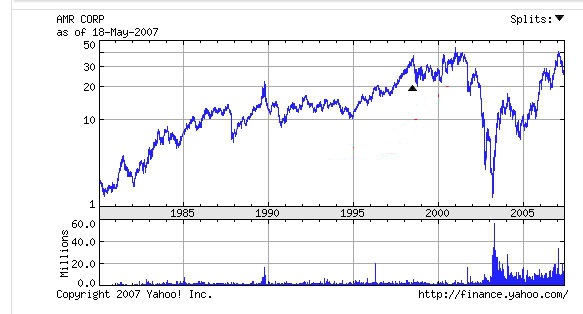 American Airilnes shares regularly had low volumes of trading and a relatively stable share price. In September of 2001, the value of the stock dropped dramatically during increased lelvels of trading amidst fears over the industry. As those fears proved false, the value of the stock began returning to normal, share trading volume was still elevated as people saw an opportunity to buy the stock before it returned back to previous levels.
What happened in 2001 that caused this dramatic drop in American Airlines share price?
What You Should Know after Today
- describe a possible situation for a given graph
- draw a possible graph for a given situation
Resources
- Notes
- Worksheets
Assignment
- p274 #1-6, 9, 10, 13, 14, *12, *15
- Worksheet
| File | Description | File size |
|---|---|---|
| Notes: Part 1 | 3525 kB | |
| Worksheet | 735 kB | |
| Notes Part 2 | 3772 kB |